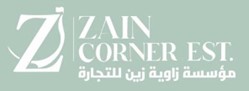
Zain Corner’s old logo lacked the modernity and professionalism needed to reflect their growing presence in the market.
Typography felt traditional but not distinctive.
Brand color was muted without strong visual impact.
The logo structure didn’t adapt well to different applications (print, signage, digital).
Our Process
Brand Discovery – Conducted interviews to understand brand values, target audience, and market positioning.
Research & Analysis – Studied competitors and identified opportunities for stronger brand differentiation.
Concept Development – Explored various logo directions with a focus on modern typography and clean geometry.
Color Palette Redesign – Chose a bold, confident color scheme to enhance recognition.
Applications & Guidelines – Created a full brand manual covering logo usage, typography, color codes, and applications across stationery and digital platforms.
The Solution
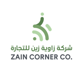
The new Zain Corner logo features a clean, contemporary wordmark with balanced typography and a refined symbol.
Professional & Timeless: Works across all business formats.
Versatile: Scales seamlessly from business cards to building signage.
Consistent: Unified brand identity across print and digital channels.
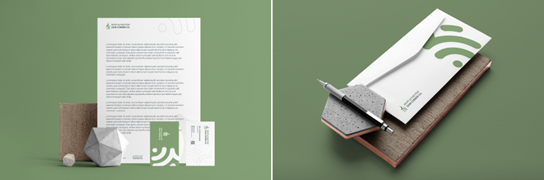
Brand Applications
The updated identity was applied to:
Business cards
Letterheads & Envelopes
Corporate Profile
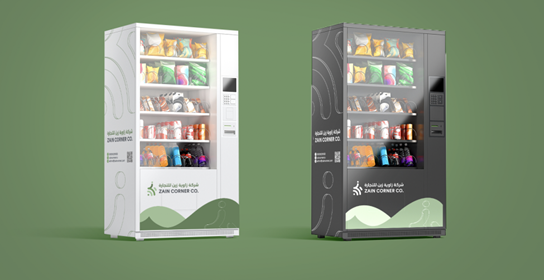
Vending machine customized design
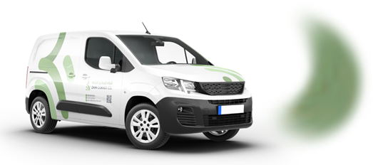
Vehicle Wrap
Uniform
Logo motion intro
Impact
Zain Corner now projects a modern, trustworthy, and professional image that resonates with their audience and stands out in a competitive market.
Looking to make your mark? We'll help you turn your project into a success story.
Ready to bring your ideas to life? We're here to help